

Although I am away from my main university in Portugal because I am in Erasmus, I decided to tag along with a project of a Cinema magazine. Two of my colleagues, one from my year, Gonçalo, and one from the 3rd year, Vasco, decided to create a culture magazine with poetry, movie selections, photography and events. There should be 2 magazine editions per semester!
They contacted me to help them with the design of the cover and layout of the magazine and I accepted!
Right now we are still finishing off the cover but soon I will start with the layout. (Will probably have to install Indesign).
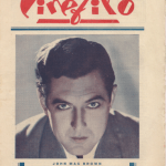
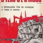
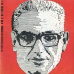
At first Vasco sent me a few references I should guide myself with:
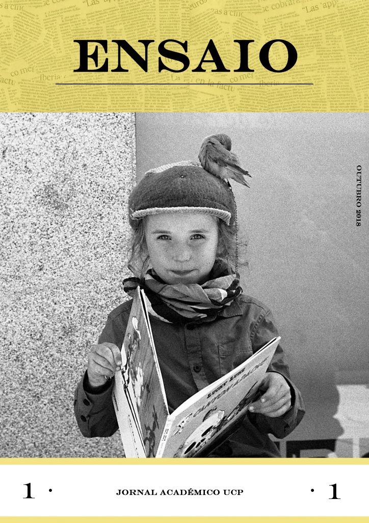
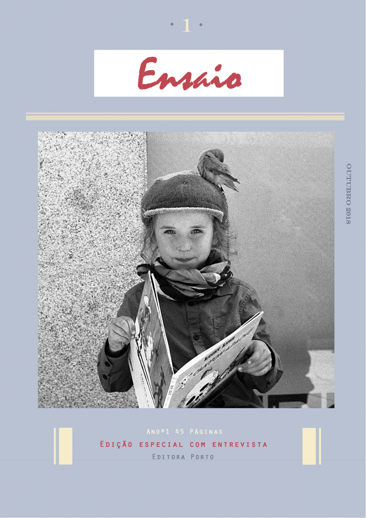
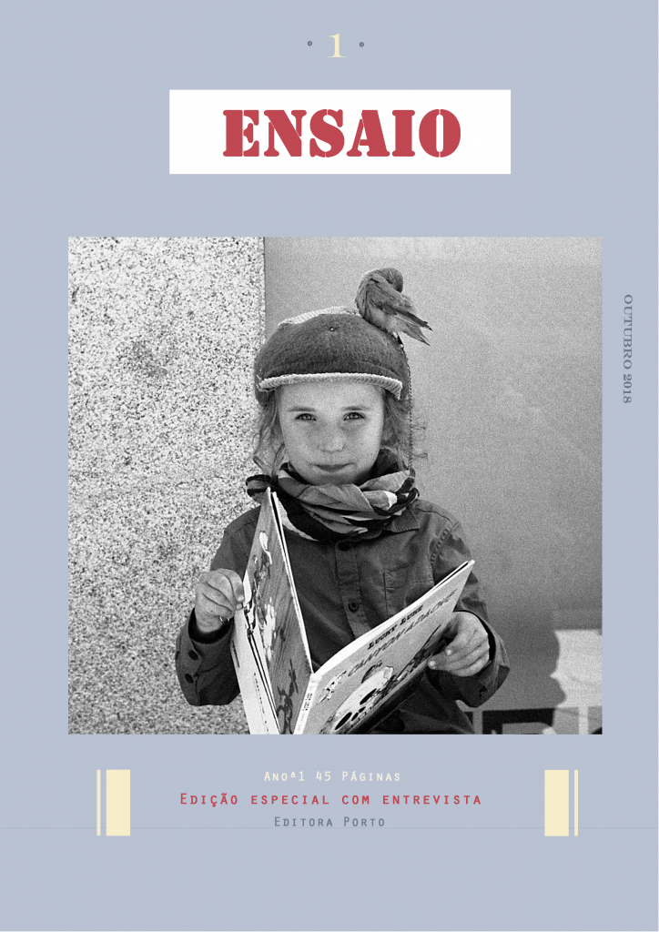
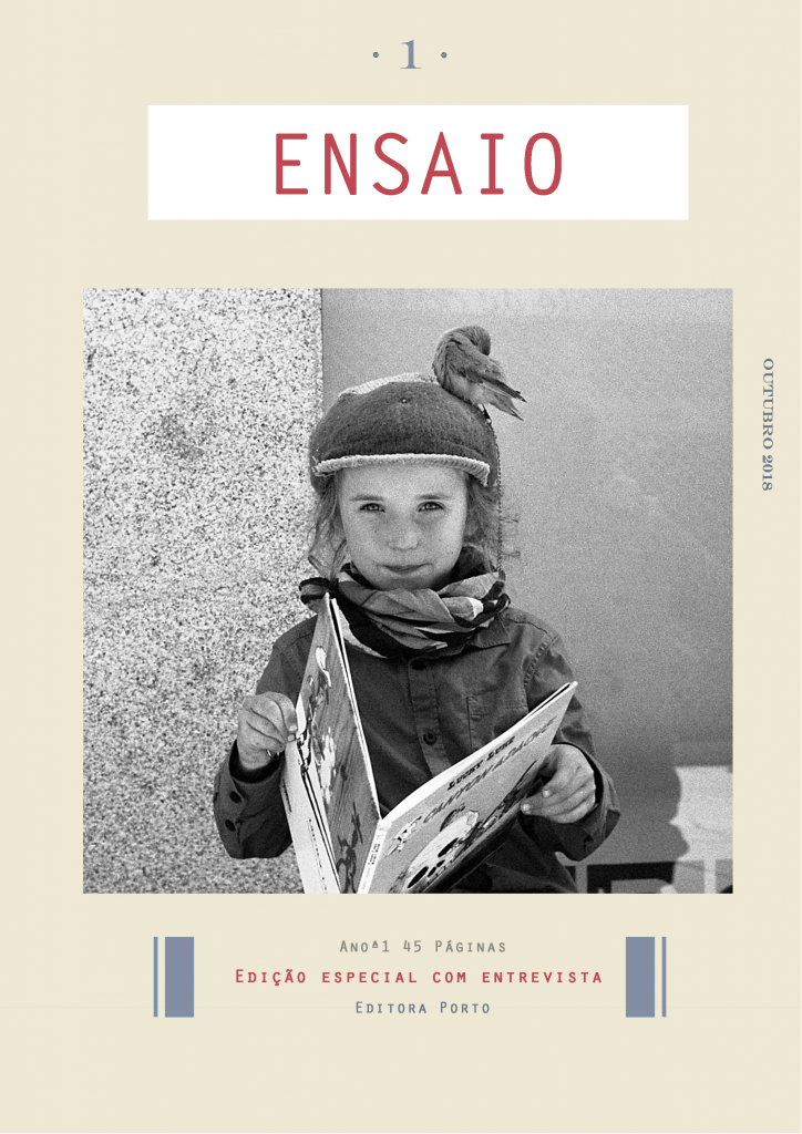
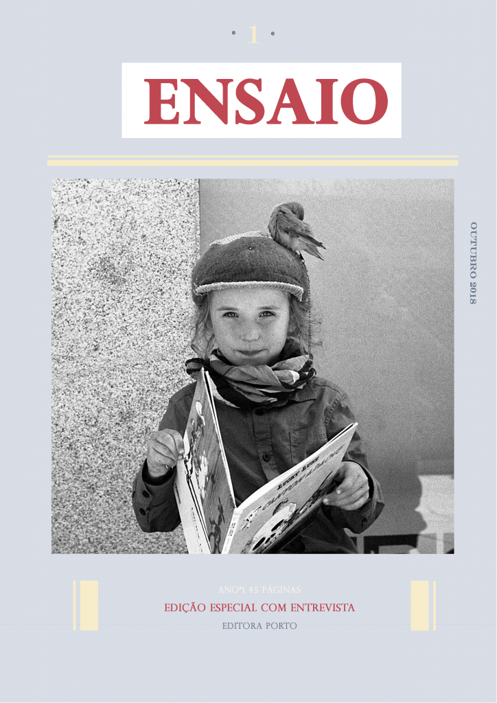
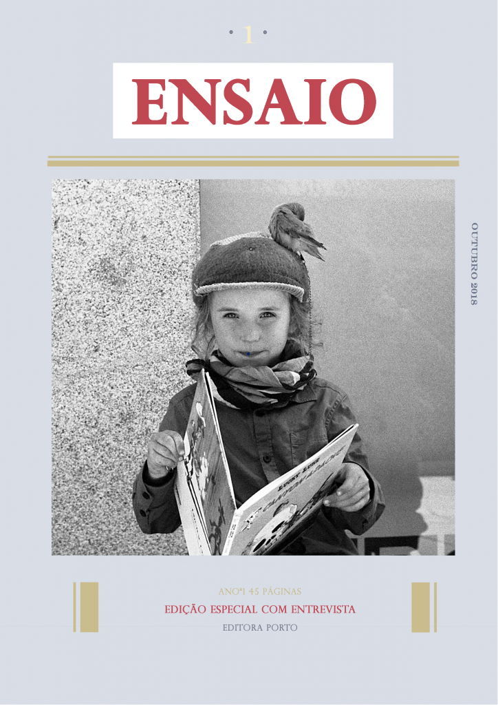
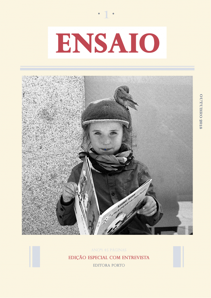
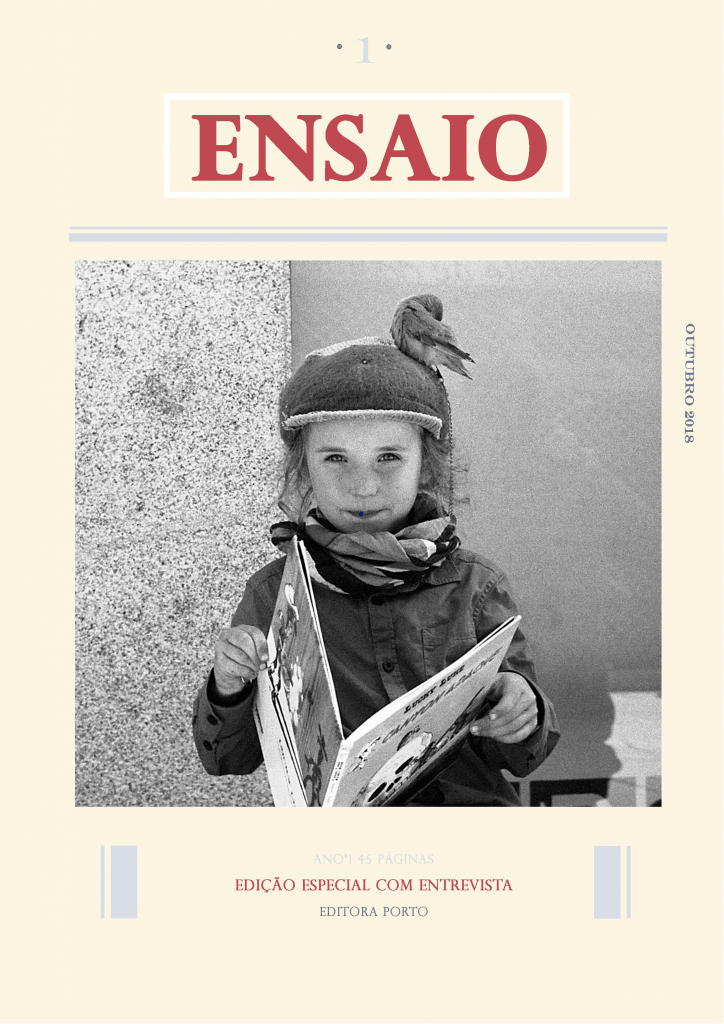
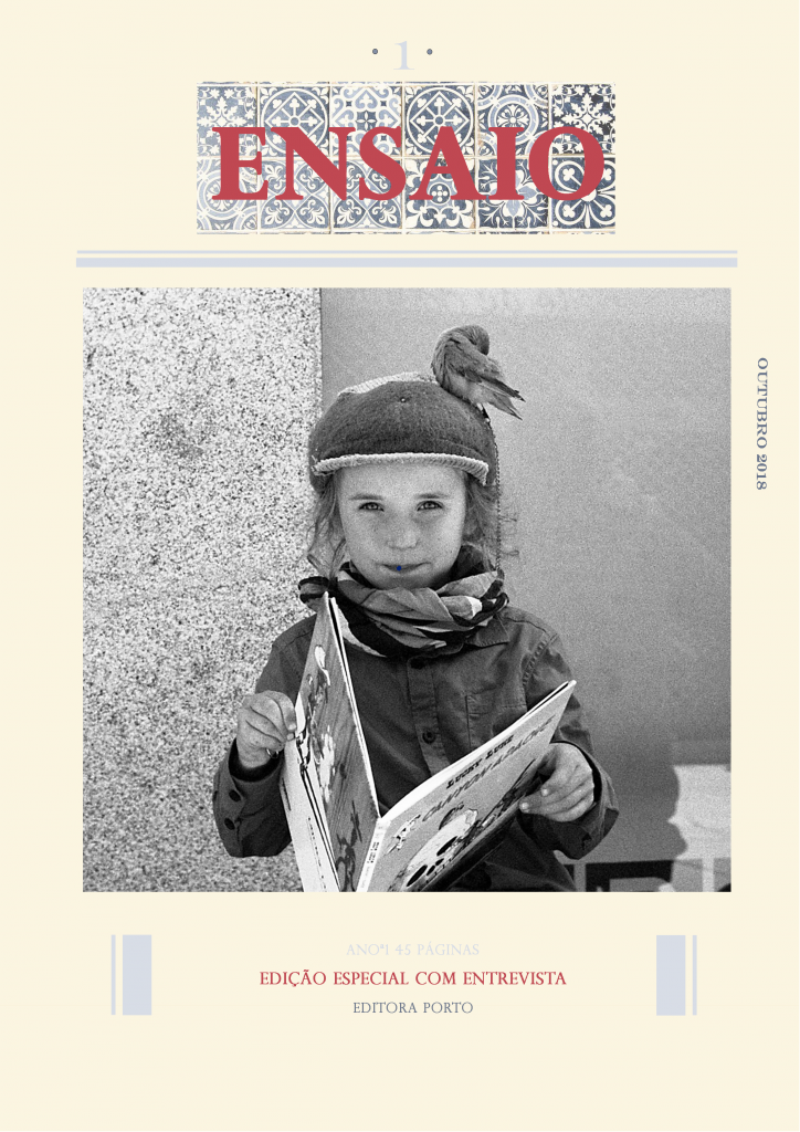
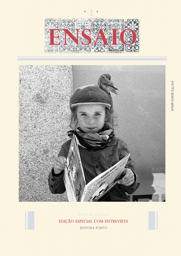
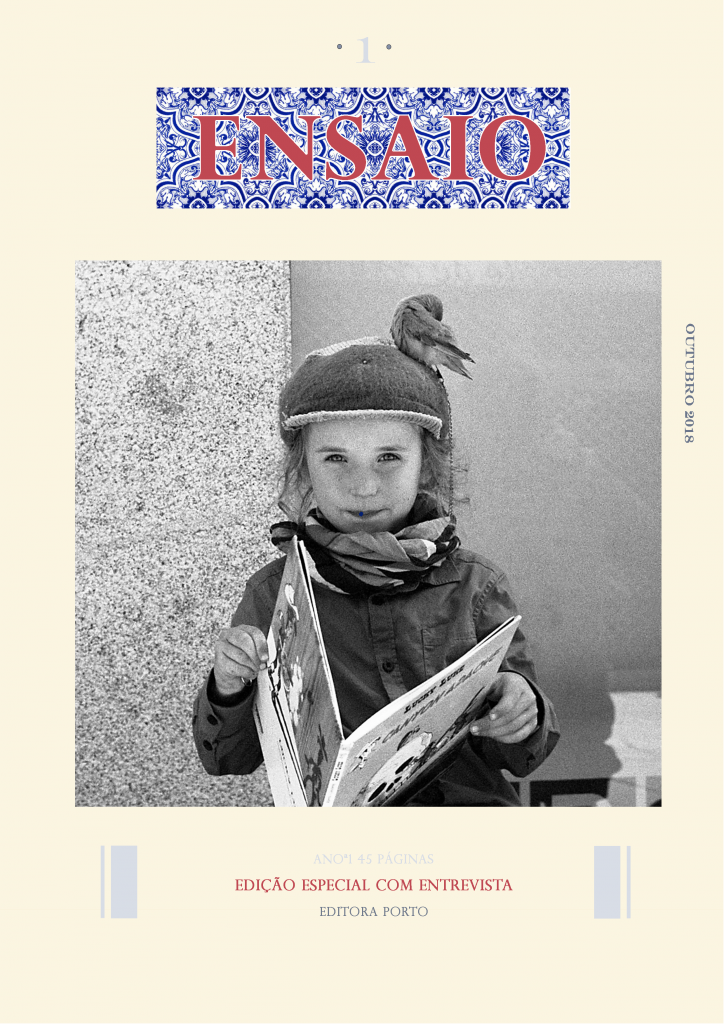
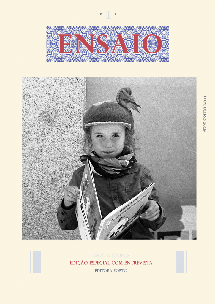
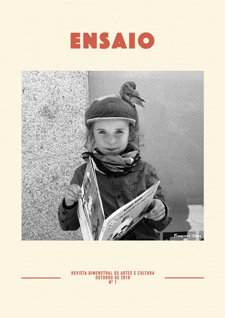
They told me to use this picture and focus on this palette of colors:


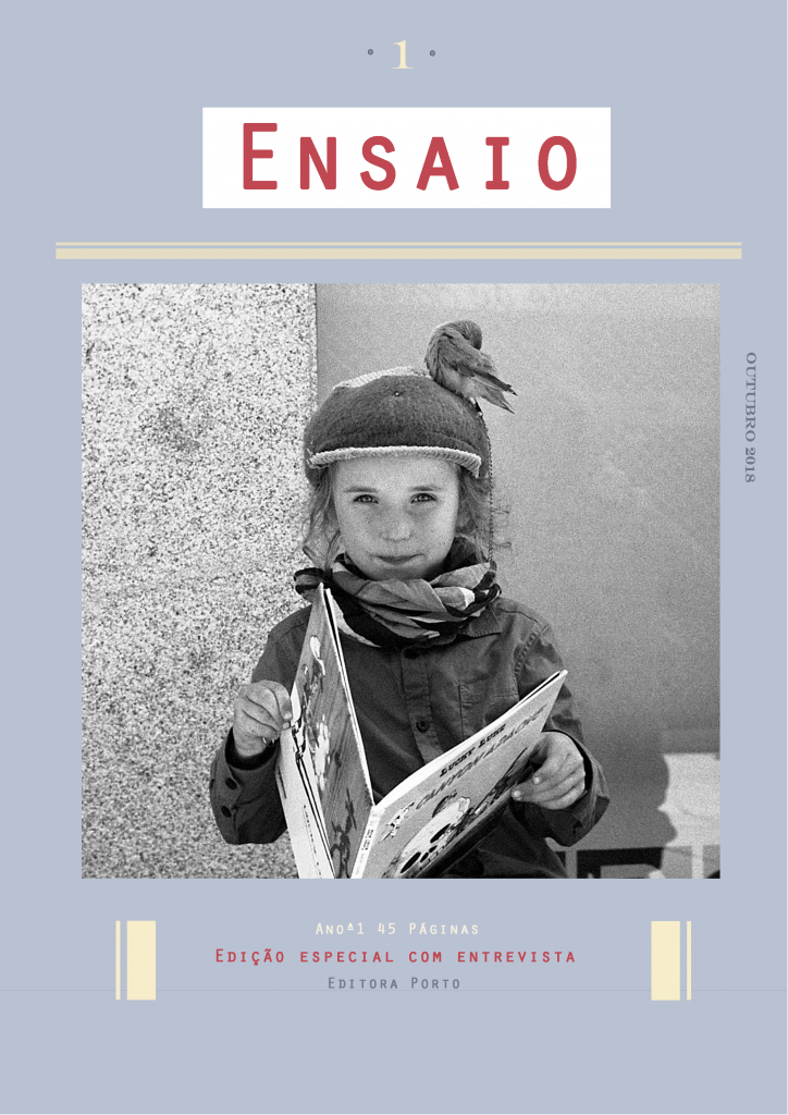
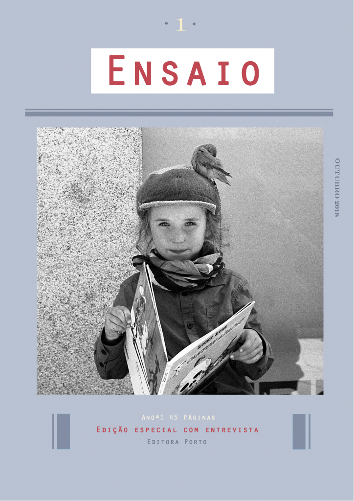
My first tries were not at all the style they wanted but after a few versions we managed to understand each other. Here is the evolution:
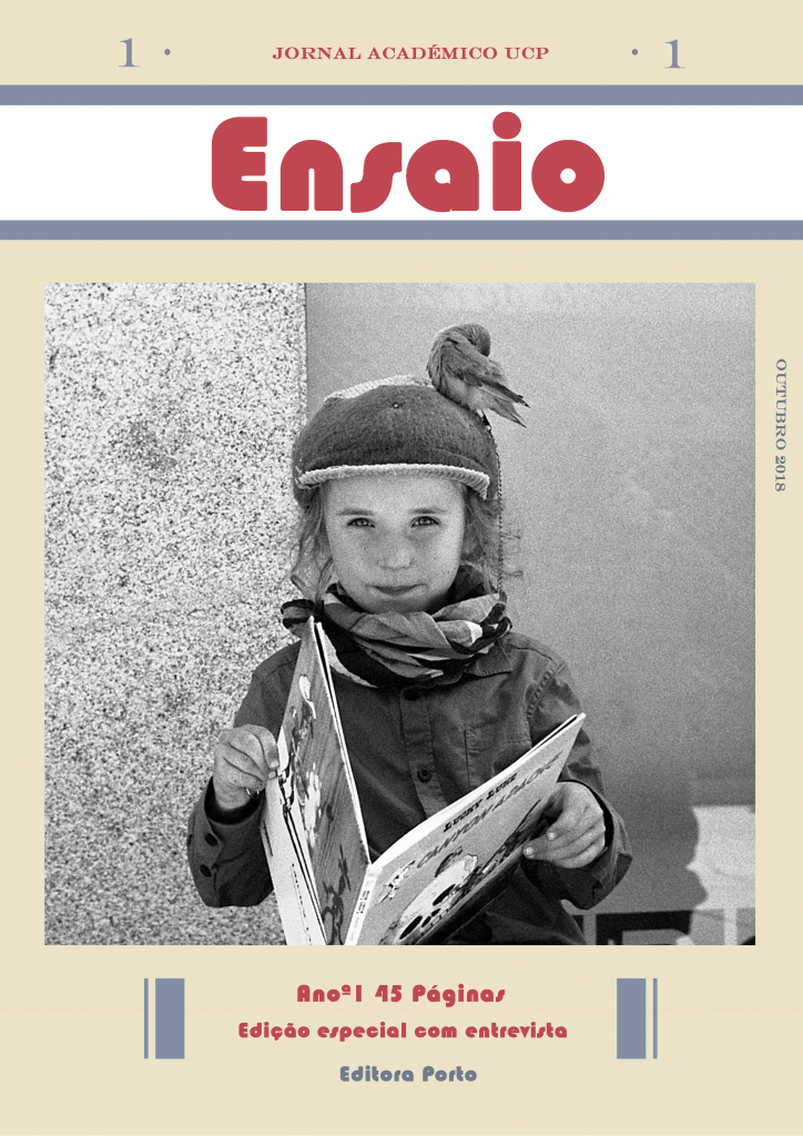

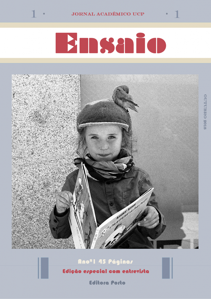
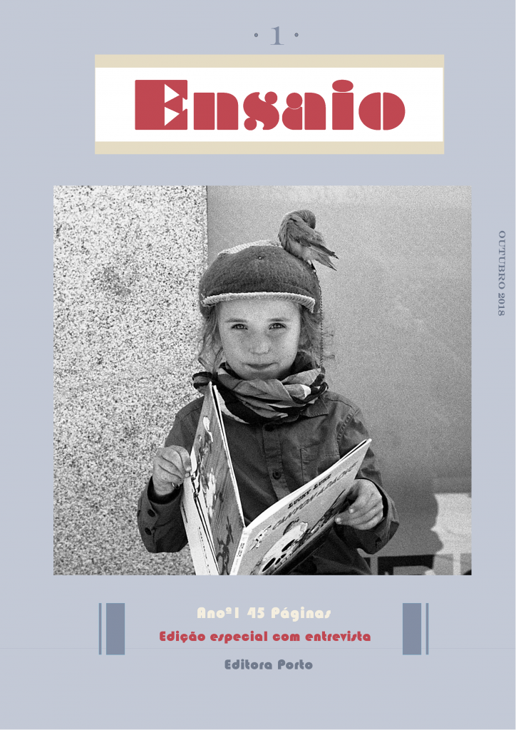
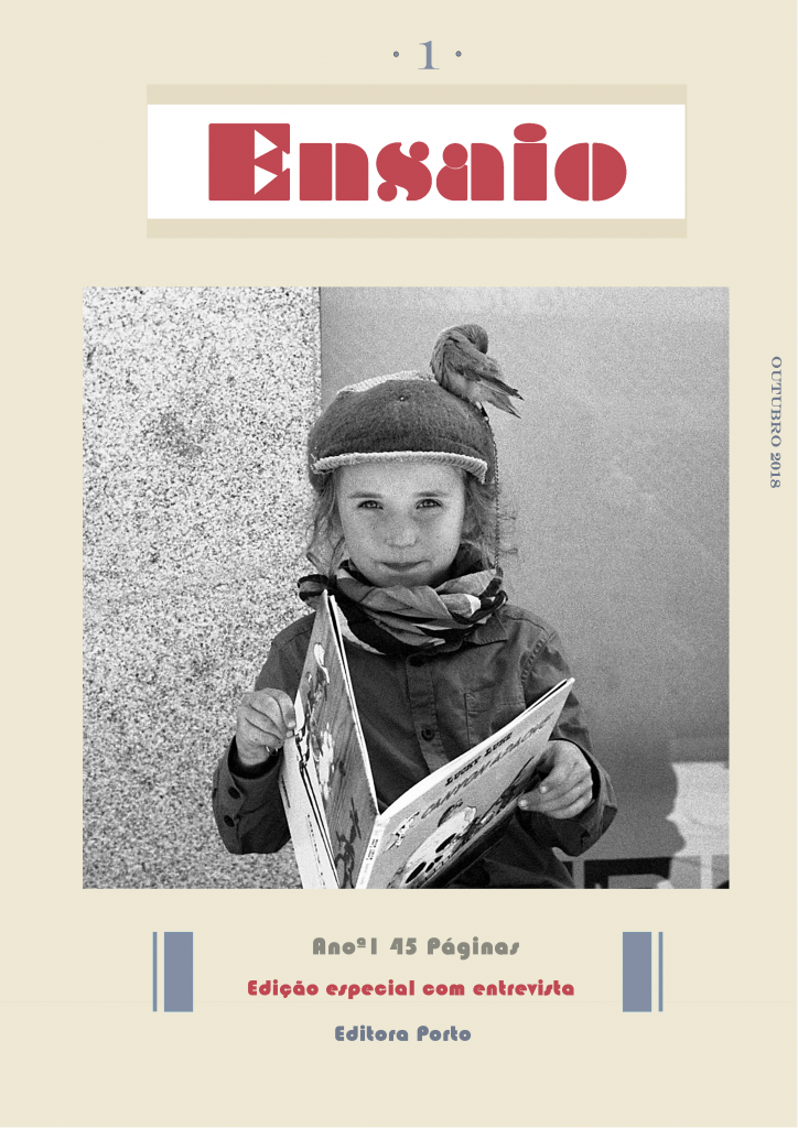
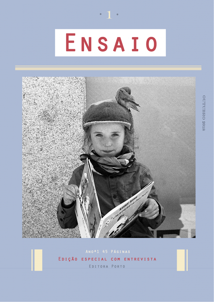

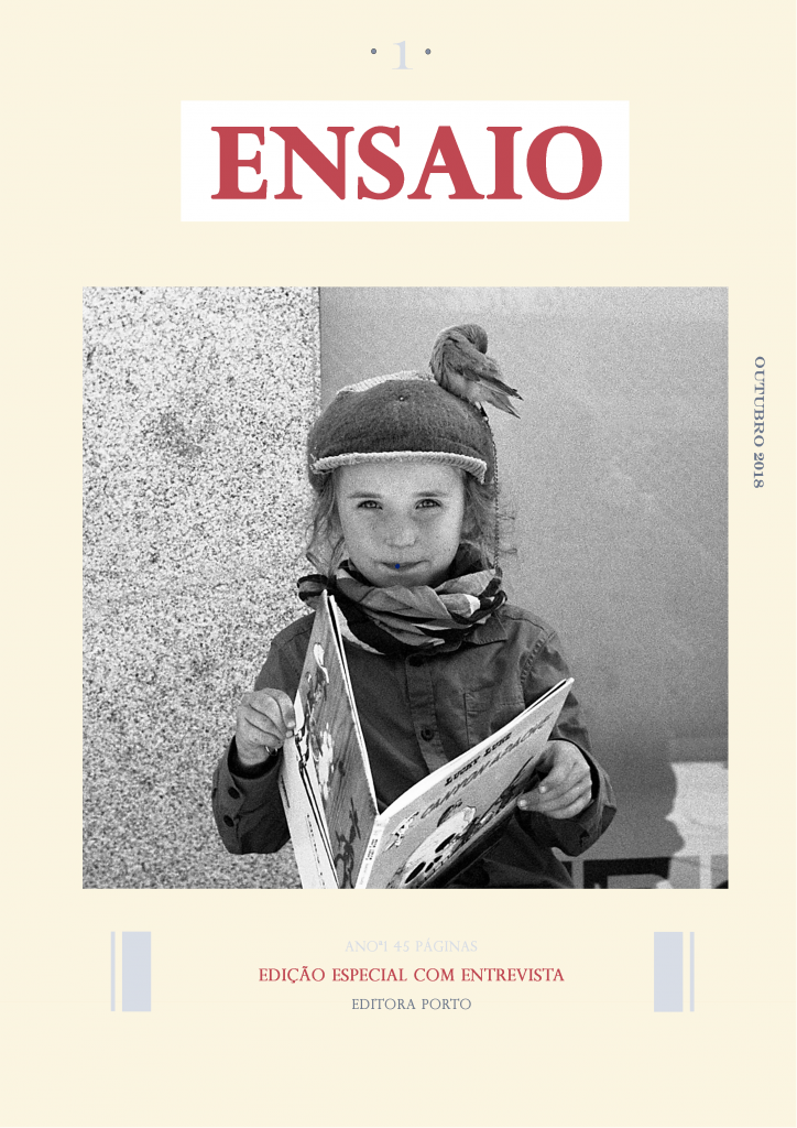

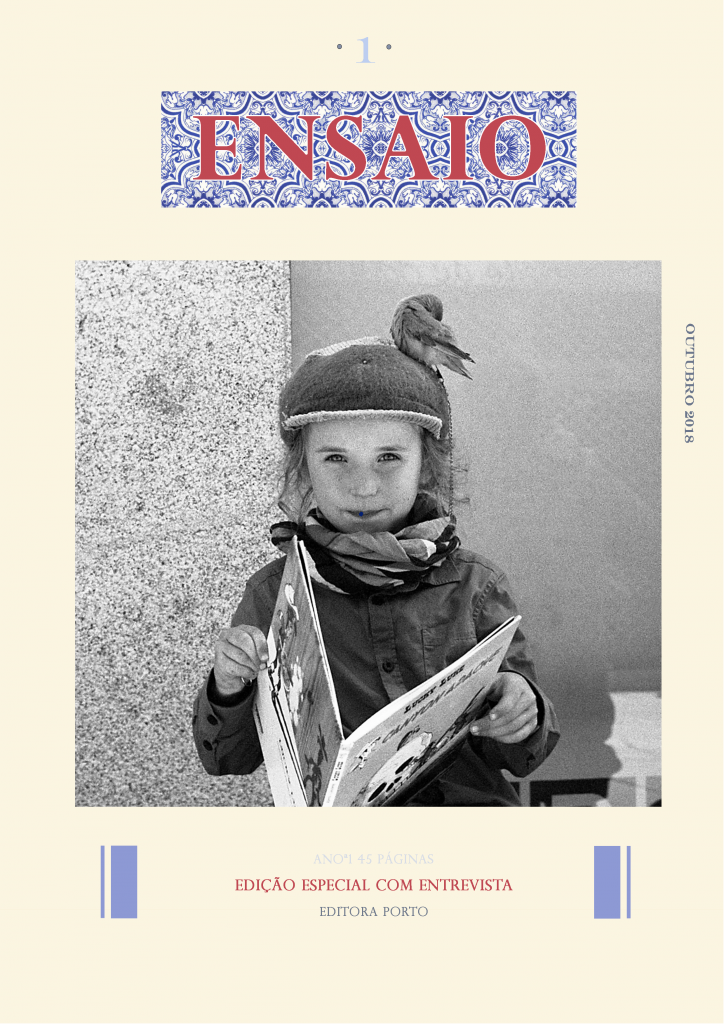
At the end of all this they took sometime to get some feedback from other people. I was honest with them and told them that for me it did not work as a cover, it actually looked bad and that they should re-think what they wanted to express with the cover. I pointed out some things:
- The square picture looks old, that a picture that would fill the whole cover would look much better
- The black and white photo with the color doesn’t really work
- They were too stuck on their references
- The beige background was not good. I think they chose it because of their references but the references are pictures of magazines that were already old and the color faded out and turned beige/yellow-sh.
- The lettering is not modern and the cover itself doesn’t called for the magazine to be read!
I asked for different pictures, with more color, and asked Vasco to describe what he wanted to express with the cover. He answered: “Freshness, personality and irreverence”. After this statement it was easier for me to get what he wanted and we got back to work!!!
They sent me some references made by them to explain the style they wanted:
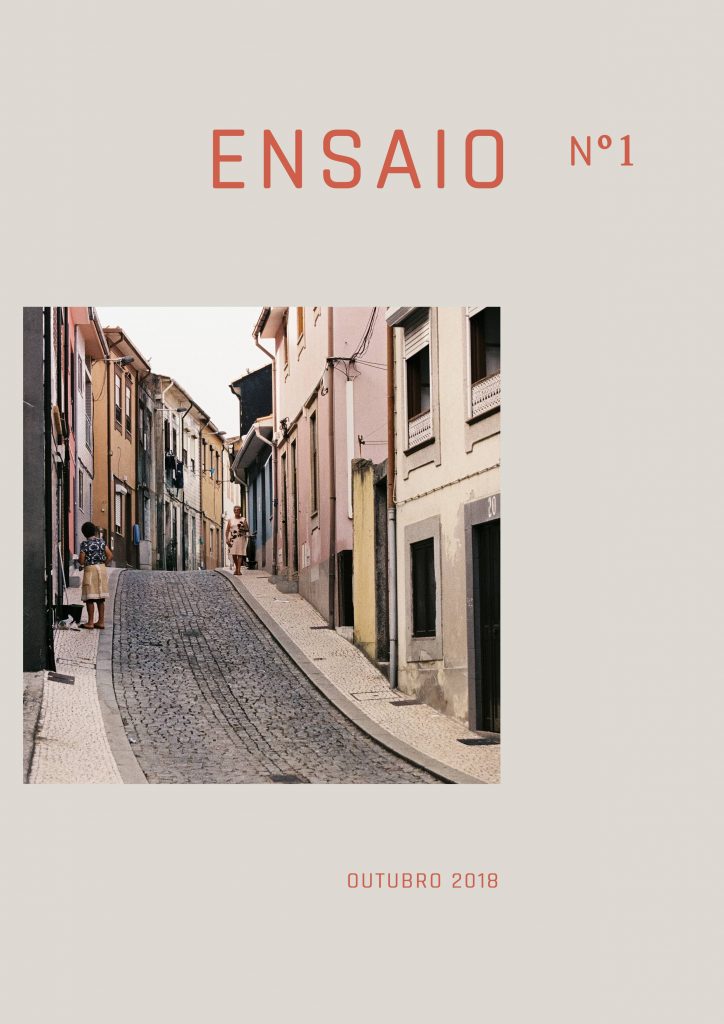
After sending me this I asked them to trust me and to send me the new and colorful pictures from their selection. I went on a completely different way… Here are the new pictures they sent me:


And this is what I did with them!


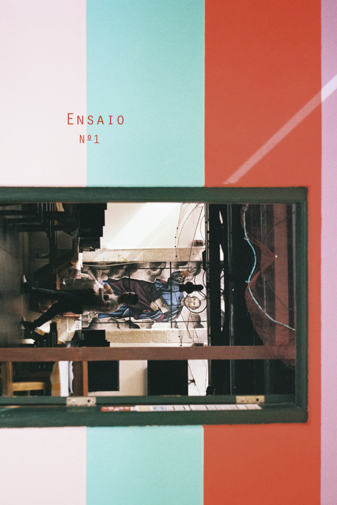
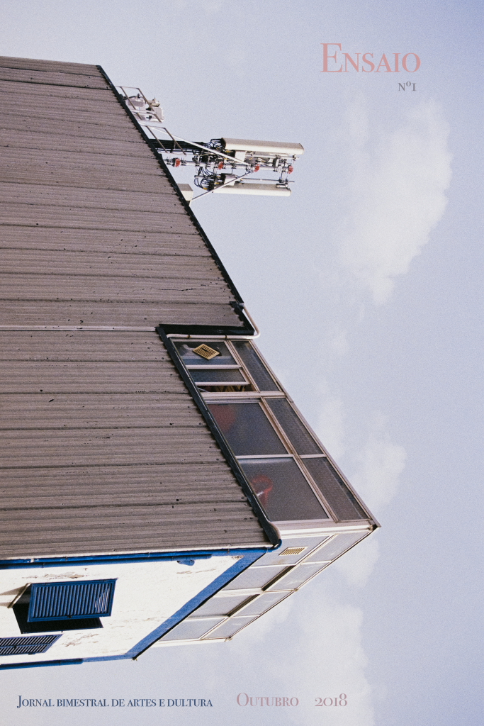


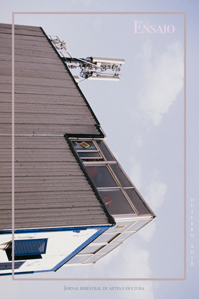
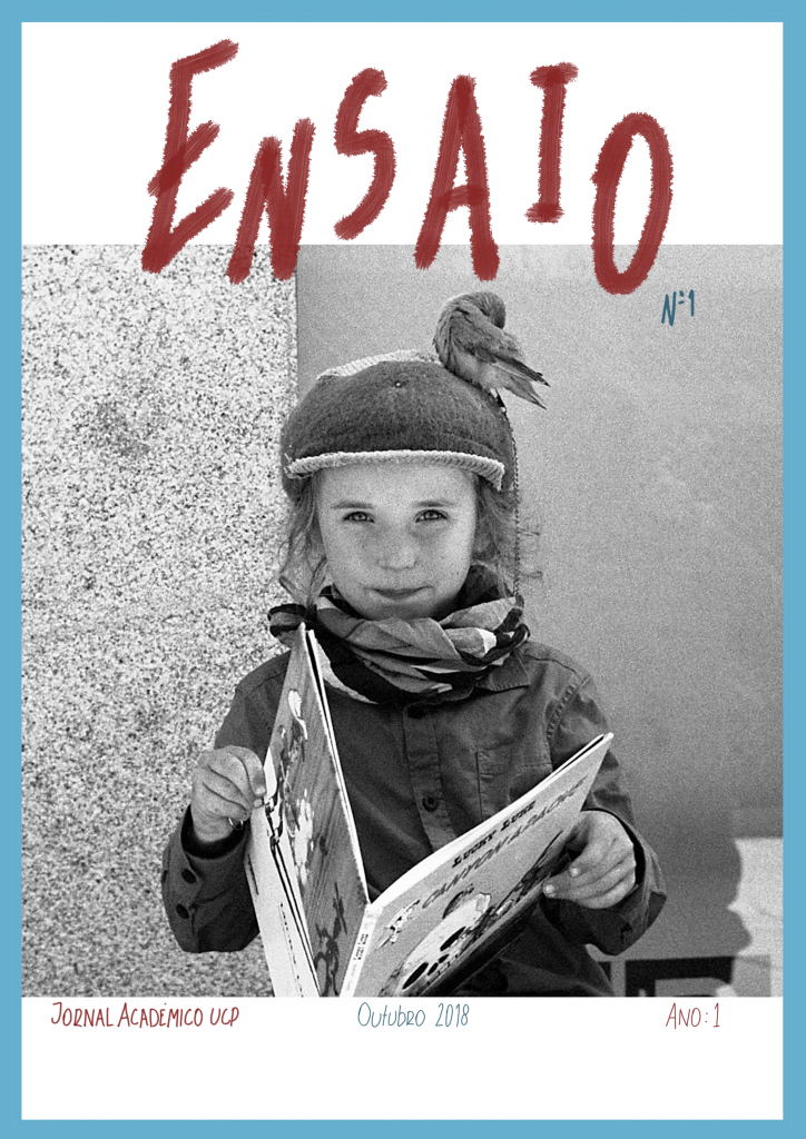
They really liked the last versions with the picture of the building!
Right now we are figuring out the font we want to use!
It has been a lot of work working on this. It is hard to give exactly what the “client” wants without adding our personal touch and what we might love they might hate…
It hasn’t been easy but I am learning a lot!
Stay tuned 😉