
In the last couple of classes we printed our design in 3 different colors.
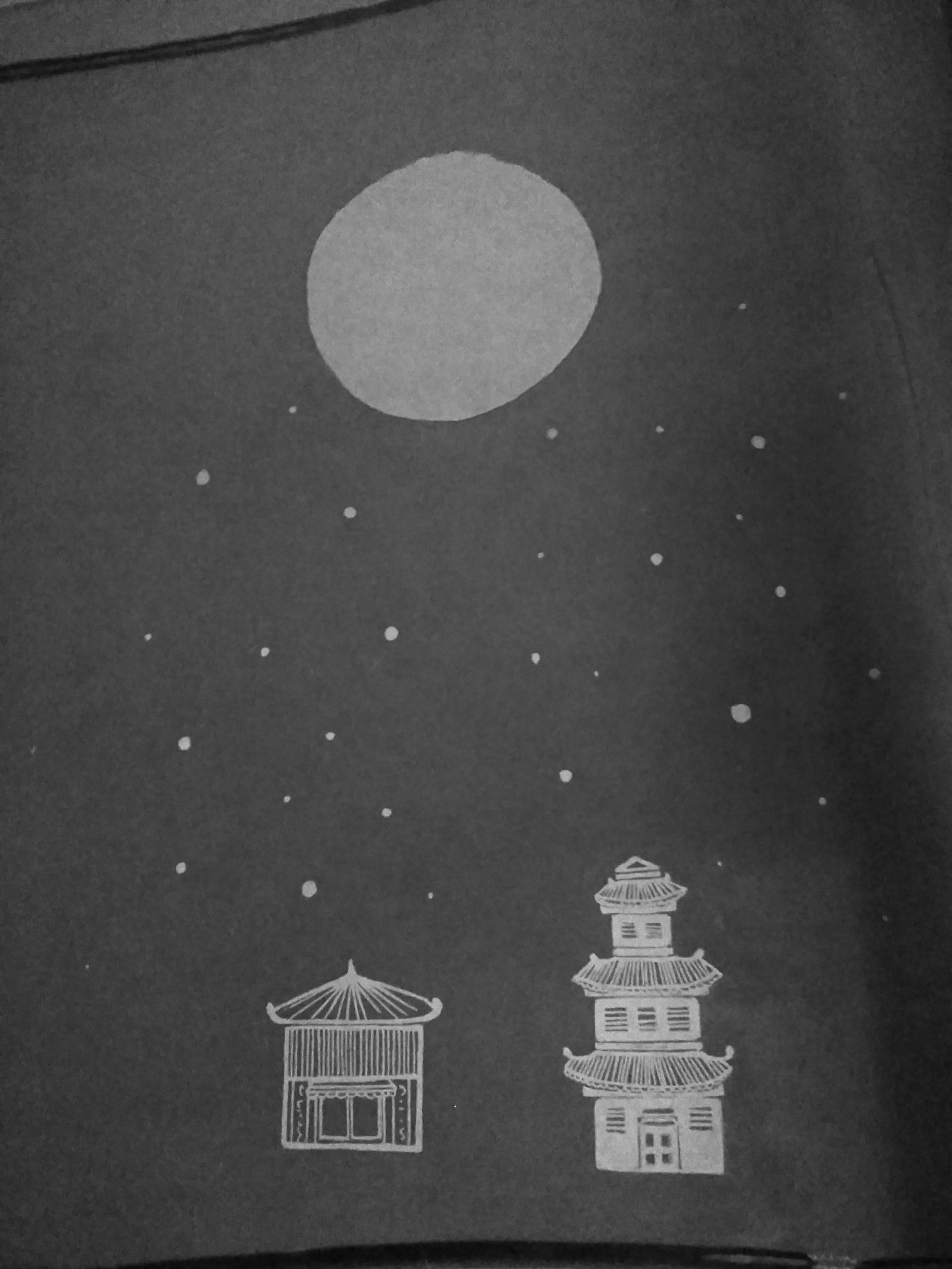
My design had the same little girl as the first one. I made some Japanese buildings silhouettes and a big Japanese lamp. In this design I was looking for detail… I wanted to see how much detail I could put into screen printing (hand-made).
I wanted to try really different colors so I chose blue, red and yellow. I had to separate my design according to colors so for 1 print I had to make 3 design. Like this:


- Left – Blue
- Middle – Red
- Right – Yellow
Here are the stages of the print:


Outcome: I realized several things after this first color experience.
- Yellow is not a good color suited for small details
- The 3 colors I chose don’t really go together, at least in my opinion
- When making the design, I have to be a lot more precise for things to be straight
Although I am not really satisfied with the outcome it was a good way oft trying out my options and I am sure that the next design/print will be much better!