After reflecting a bit I realized that I really had to come up with a logo to mark my work, mostly because I post a lot of things online.
Firstly I did some studies on my name: what I wanted people to read; what letters to include; what kind of shape, either a circle or a square..
Here are some of my initial studies:

I didn’t know which program to use so I decided to finally start learning how to work with illustrator. It is a really important tool for someone longing to an animator.
At first, I took a while to understand how the program works but I got there after watching a few videos on Youtube. In some ways, illustrator works similar to Photoshop.
In the future, I really want to give some colour to the logo but I still don’t know which ones. I already started looking for colour meanings and what they transmit to people that see them. I want to find something that matches my personality and my work.
My logo has to be something that includes the diversity of my work and interests and that is really hard to achieve.
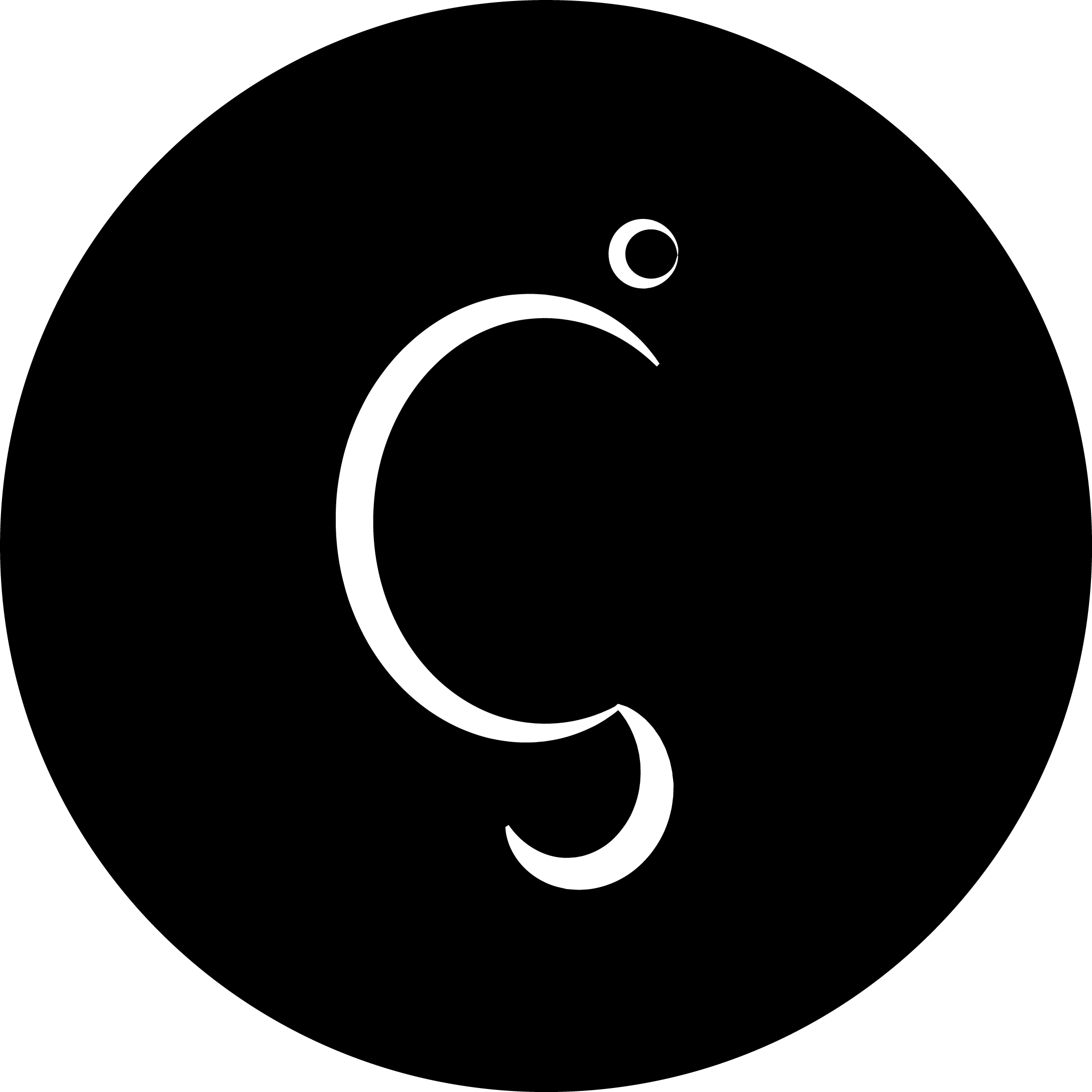
Here is my first try on illustrator

It’s supposed to be the letters G and I (making Gi) but in an abstract way, I’m not sure people will get there by themselves but I also don’t want it to be too obvious. One person already told me it kind of looks like a Turkish letter but.. We will see what changes I will make.
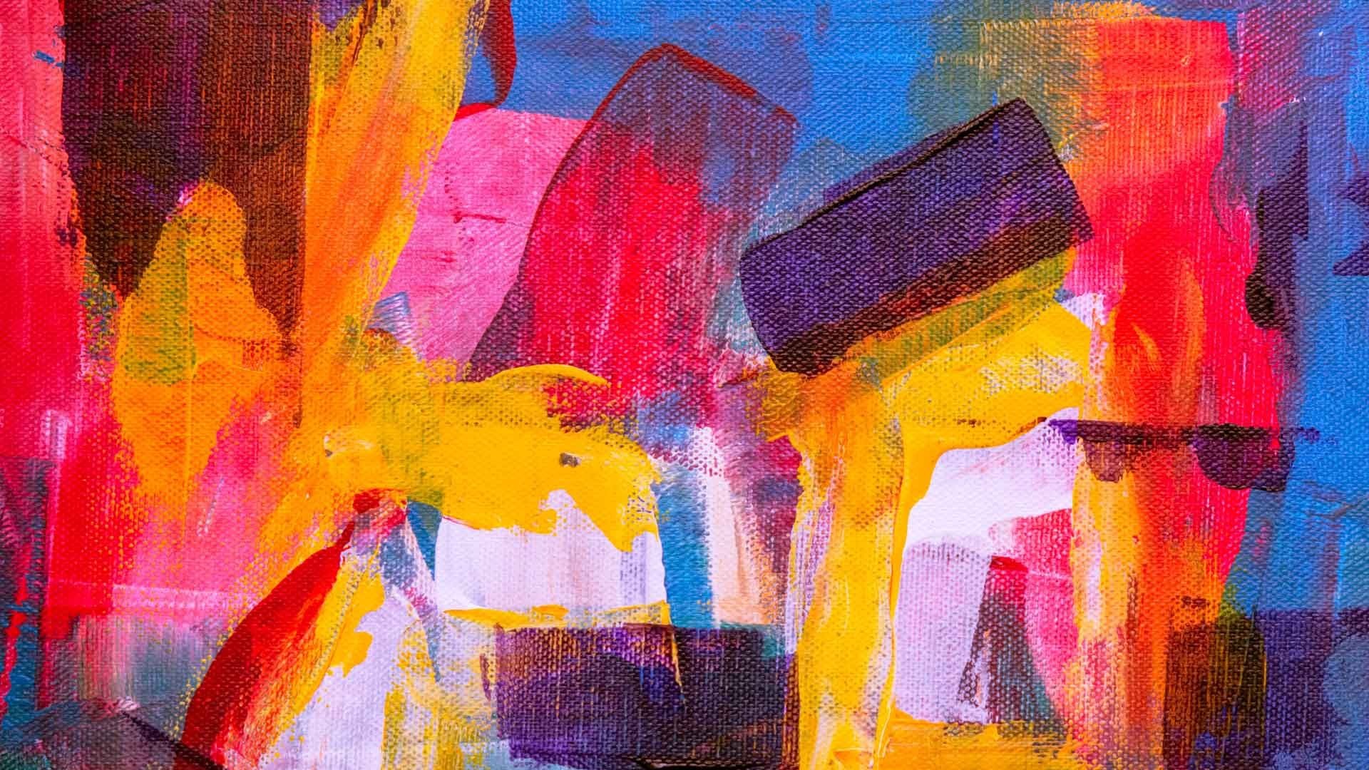
After making this first draft I imported it into Photoshop to work with some images behind, some backgrounds. And I thought I could make a use of my brand like that, depending on my work, I change the collage.
Here is the Photoshop one:

My background source is pinterest and I use it a lot as a tool of ideas! Here is my background album on pinterest.

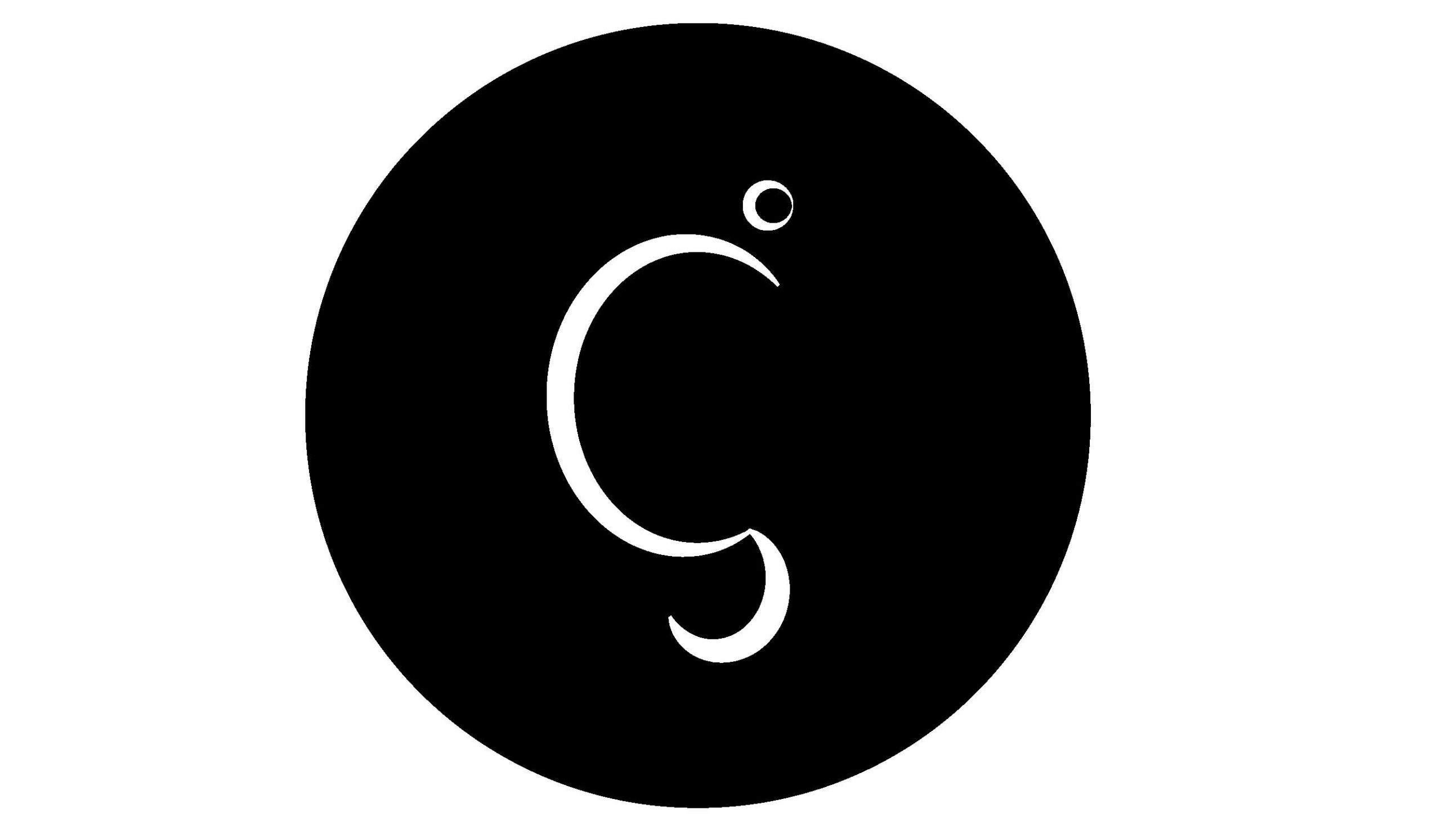
After, I went back to illustrator and tried something else. This was result:
 Personally, I think his one works better to mark pictures with my work but I would like to give it colours and such…
Hoping to get some feedback here! I will search more so I can keep working on it.


5 pensamentos em “Logo Design – Illustrator/ Photoshop”
Amazing work and creativity Maria, congratulations. From today on, this is my favourite ever logo! (R just turned 2nd…)
It says it all, not being obvious, but that’s exactly the beautiness of it, as well as from people you know, they will get it at first glance, the ones that don’t, will stop and think!… (rare these days).
It’s uniqueness will help develop your “brand” to become unmistakable.
For me, black is dead, unpresence of life, joy, so my choyce definately goes for the blue, although you will have to apply it on b&w printings and layouts, so will do as an option on the brand rules book.
Feeling 😍😍😍
Thank you so much!!!!! It really means a lot 🙂 I am glad the logo says exactly what I wanted it to say!